01 | MISSION
To help communities work equitably and inclusively in order to build a strong democracy and improve the quality of life for everyone.
02 | BRAND CONTEXT
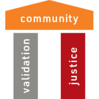
Our brand is a vehicle for providing the resources for community members to do the work of strengthening their communities, themselves. We are prepared to hold the tension of connection through unity and disruption where we identify, participate in, and heal from the broad systems that influence our lives. We acknowledge a pillar of community engagement is the honoring and validation of the experience, knowledge, and power of the individual. And we recognize the collective work of justice as the necessary shift of power steadily toward equity. We are determined to see all aspects of our brand reflect this truth with our vision clearly focused on freedom.
03 | BRAND GOAL

04 | LOGO
Logo Clearspace
Clearspace around the logo is equal to the cap height of the letter D.
Logo Color
Logo should be full color on lighter or white backgrounds.
It should be white on darker backgrounds and all black when one color print is required.
Logo Scale
Smallest size: for web: 120 pixels wide / Smallest size: for print: 1.5 inch wide.

Logo Guidance
Don’t stretch the logo.
Don’t use the logo in color.
Don’t use other fonts.
Logo for Social Media
The Everyday Democracy logo should be shortened for social media use.

05 | BRAND COLORS
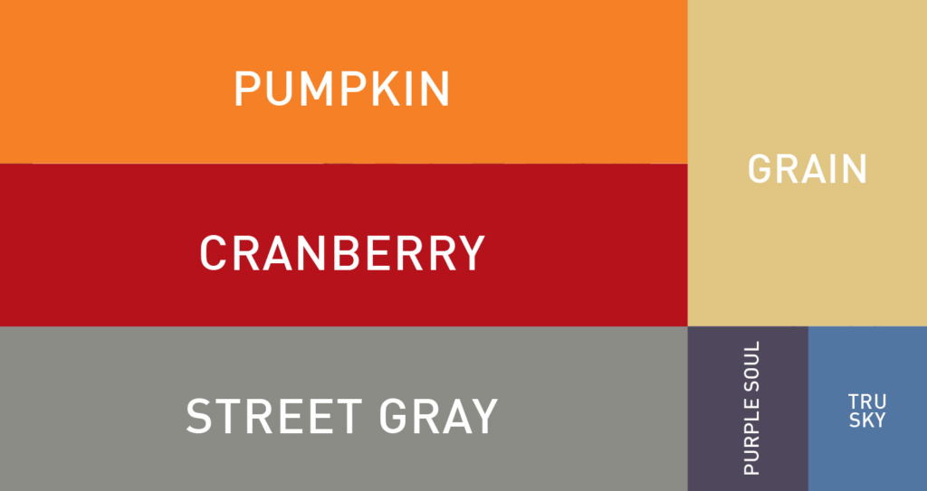
PUMPKIN
RGB 245 128 37
CMYK 0 61 97 0
HEX f48024
PMS 144C
PMS 144U
CRANBERRY
RGB 181 18 27
CMYK 0 100 96 28
HEX b4111a
PMS 7427C
PMS 1935 U
STREET GRAY
RGB 140 140 135
CMYK 47 39 43 4
HEX 8c8c87
PMS 423C
PMS 423U
GRAIN
RGB 225 197 131
CMYK 12 20 57 0
HEX e1c583
PMS 7500C
PMS 7500U
PURPLE SOUL
RGB 78 73 91
CMYK 70 67 44 29
HEX 4e495b
PMS 7448C
PMS 7448U
TRU SKY
RGB 83 118 163
CMYK 73 50 16 1
HEX 5376a3
PMS 7454C
PMS 7454U
06 | TYPOGRAPHY
Print Font: DIN
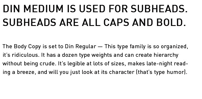
Print Font: Archer
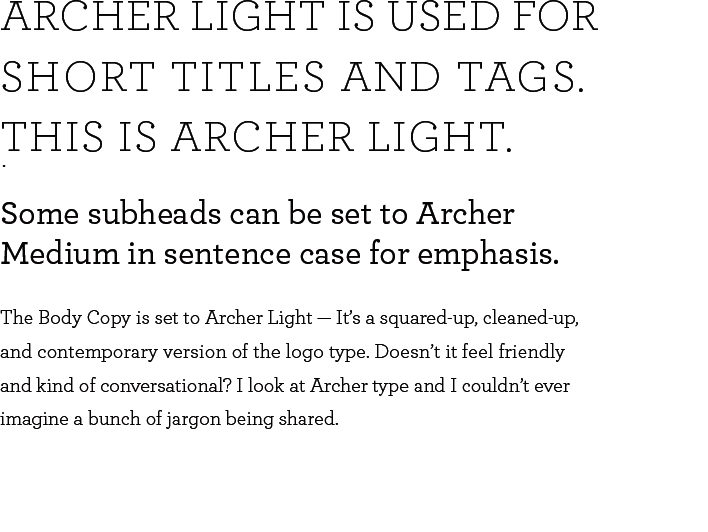
Web Font: Roboto
ROBOTO BOLD IS USED FOR SUBHEADS. SUBHEADS ARE ALL CAPS AND BOLD.
The Body Copy is set to Roboto Book — Roboto has a dual nature. It has a mechanical skeleton and the forms are largely geometric. At the same time, the font features friendly and open curves. While some grotesks distort their letterforms to force a rigid rhythm, Roboto doesn’t compromise, allowing letters to be settled into their natural width. This makes for a more natural reading rhythm more commonly found in humanist and serif types.
Web Font: Zilla Slab
ZILLA SLAB IS USED FOR SHORT TITLES AND TAGS. THIS IS ZILLA SLAB BOOK.
Some subheads can be set to Zilla Slab Book in sentence case for emphasis.
The Body Copy is set to Zilla Slab — Zilla Slab is Mozilla’s core typeface, used for the Mozilla wordmark, headlines and throughout their designs. A contemporary slab serif, based on Typotheque’s Tesla, it is constructed with smooth curves and true italics, which gives text an unexpectedly sophisticated industrial look and a friendly approachability in all weights.
07 | VISUAL ELEMENTS
