01 | Mission
The mission of the Connecticut Fair Housing Center (CFHC) is to ensure that all people have equal access to housing opportunities in Connecticut, free from discrimination.
What we are working toward:
We are engaged in an earnest fight for equity and anti-discriminatory practices. We are committed to the end of housing discrimination, specifically, and believe an urgent dedication to genuine service and support is our contribution to beating the tenacious nature of predatory discrimination.
02 | Brand Context
CT Fair Housing Center operates in community at the intersection of Justice, Truth, and Validation.
We believe housing is a right that we all have to live in a place that is safe, inclusive, welcoming, and within our financial means. Housing rights are fundamental and we defend against violation of those rights as we would any other human rights.
03 | Brand Goal
Our brand goals are as follows:
- Distinguish ourselves from the common perceptions of government agencies.
- Inspire trust in our vision, trust in the process, and trust that a positive outcome is possible.
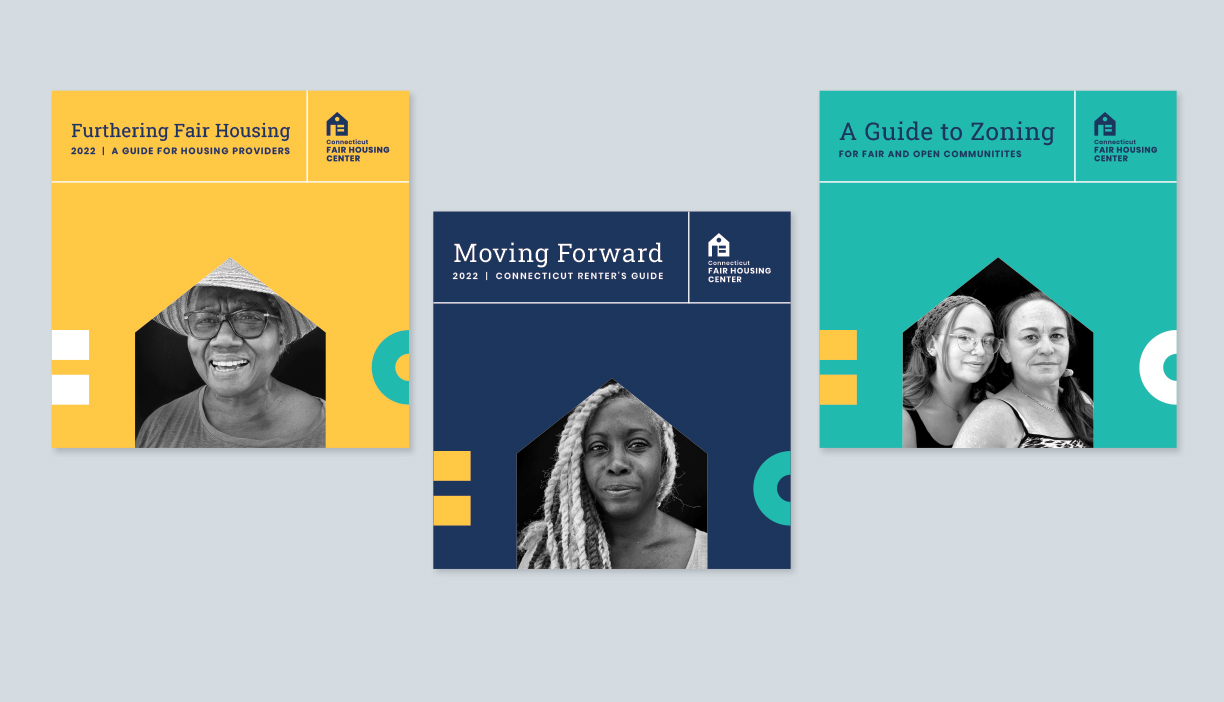
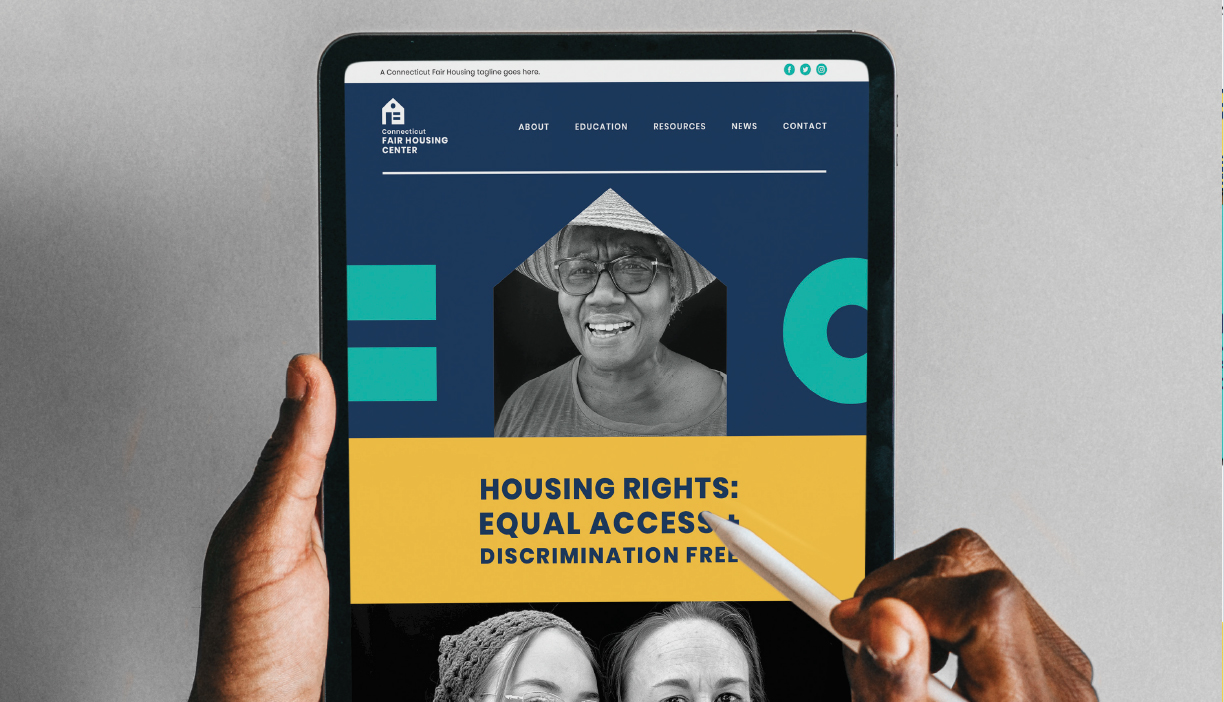
- Use our brand tools to ensure our potential clients visualize themselves as beneficiaries in these work of ensuring housing rights are upheld.
- Use our brand tools to help legislators and other stakeholders to come to a vibrant visualizations of the communities they influence.
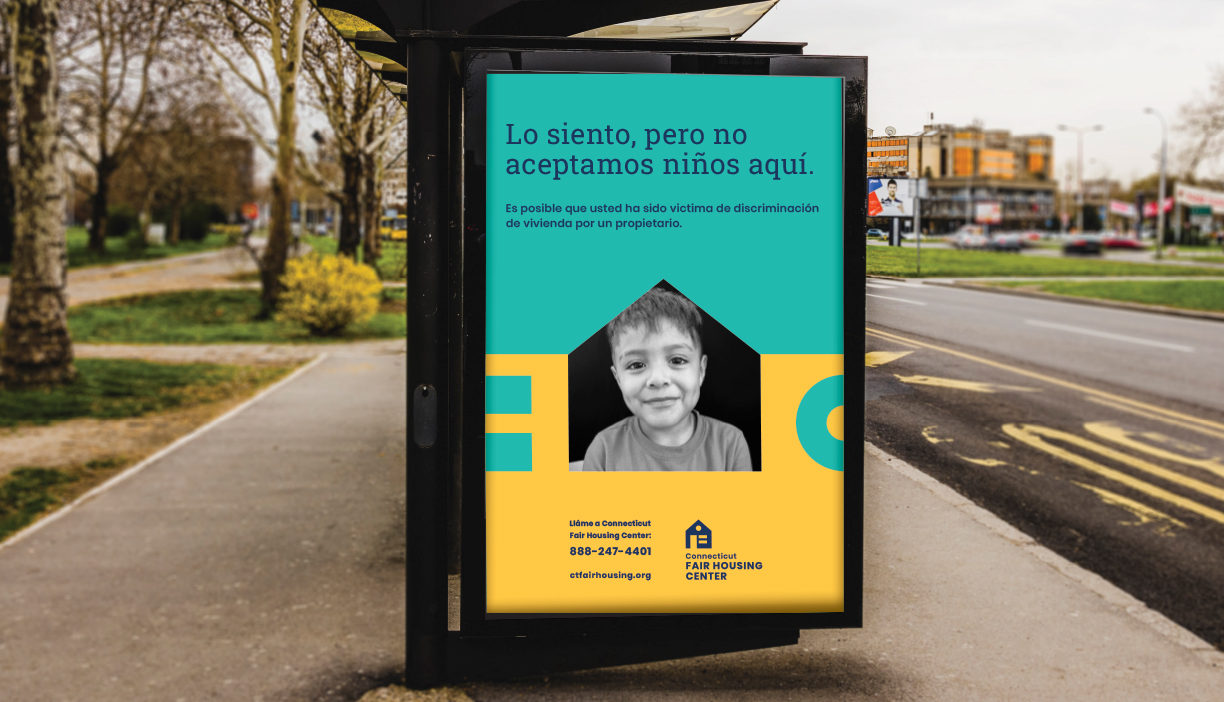
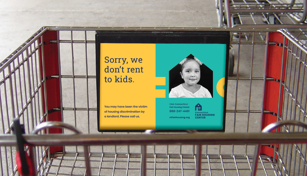
- Use our brand tools to demonstrated our steady determination to challenge those who use discriminatory housing practices.
- Ensure that the access described in our mission is formalized in all of our actions, technologies, and communications—that it comes across in all of our work.
04 | Logo
The Connecticut Fair Housing Center logo comprises two parts: The icon and the wordmark. The icon is evolution of our previous logo teases out the name in a rubric that prompts reflection on the idea of Fairness (and equity), Housing (and it’s inherent protective nature), and Center (an intentional, focused place where ideas come to fruition and ideals are upheld). These three concepts can be deconstructed so the viewer can contemplate the individual components and brought together so the viewer can recognize the interdependence of the Fair/Housing/Center concept.
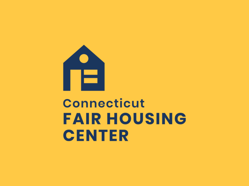
Icon Construction
Simple shapes were carefully assembled to create The Connecticut Fair Housing Center icon. The shapes represent the words in the organization’s name.
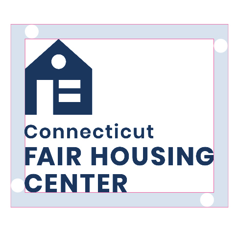
Logo Clearspace
Clearspace around the logo is equal to circle shape in the icon.
Logo Clearspace Exceptions
The logo placement depends on the type of communication and use.
Application icons
Social media icons
Logo Color
The Connecticut Fair Housing brand has been designed to be ADA compliant. To ensure maximum readability, these are the only allowed brand color combinations.


Logo Scale
Smallest size: for web: 150 pixels wide / Smallest size: for print: 1 inch wide.
Logo Guidance
Don’t stretch the logo.
Don’t use the logo in a non-brand color.
Don’t use other fonts.

Don’t pair the logo with marks other than the Compass icon.
05 | Brand Colors
The brand colors provide accessibility, simplicity, and consistency throughout all brand communications. This particular color palette is ADA compliant which means that the colors are easily read and understood by everyone.

RGB 0 191 178
CMYK 72 0 38 0
HEX 00bfb2

RGB 27 54 93
CMYK 98 83 37 28
HEX 1b365d

RGB 255 200 69
CMYK 0 22 83 0
HEX ffc845
06 | Typography
Poppins
This headline is three lines and set to Poppins Bold 700.
This subhead is half the point size of the headline and set to Poppins Medium 500.
The Body Copy is set to Poppins Normal 400—Poppins is a geometric sans serif typeface. Each letterform is nearly monolinear, with optical corrections applied to stroke joints where necessary to maintain an even typographic color.
Roboto Slab

