01 | Mission
In the spirit of the Lyme Art Colony, FloGris welcomes people of all ages and backgrounds to get up close and personal with the art of Connecticut.
02 | Vision
FloGris envisions art, history, and nature as essential to vibrant, healthy, and diverse communities.
03 | Logo
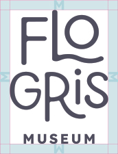
Logo Clearspace
Clearspace around the logo is equal to the cap height of the letter M in Museum.
Logo Clearspace Exceptions
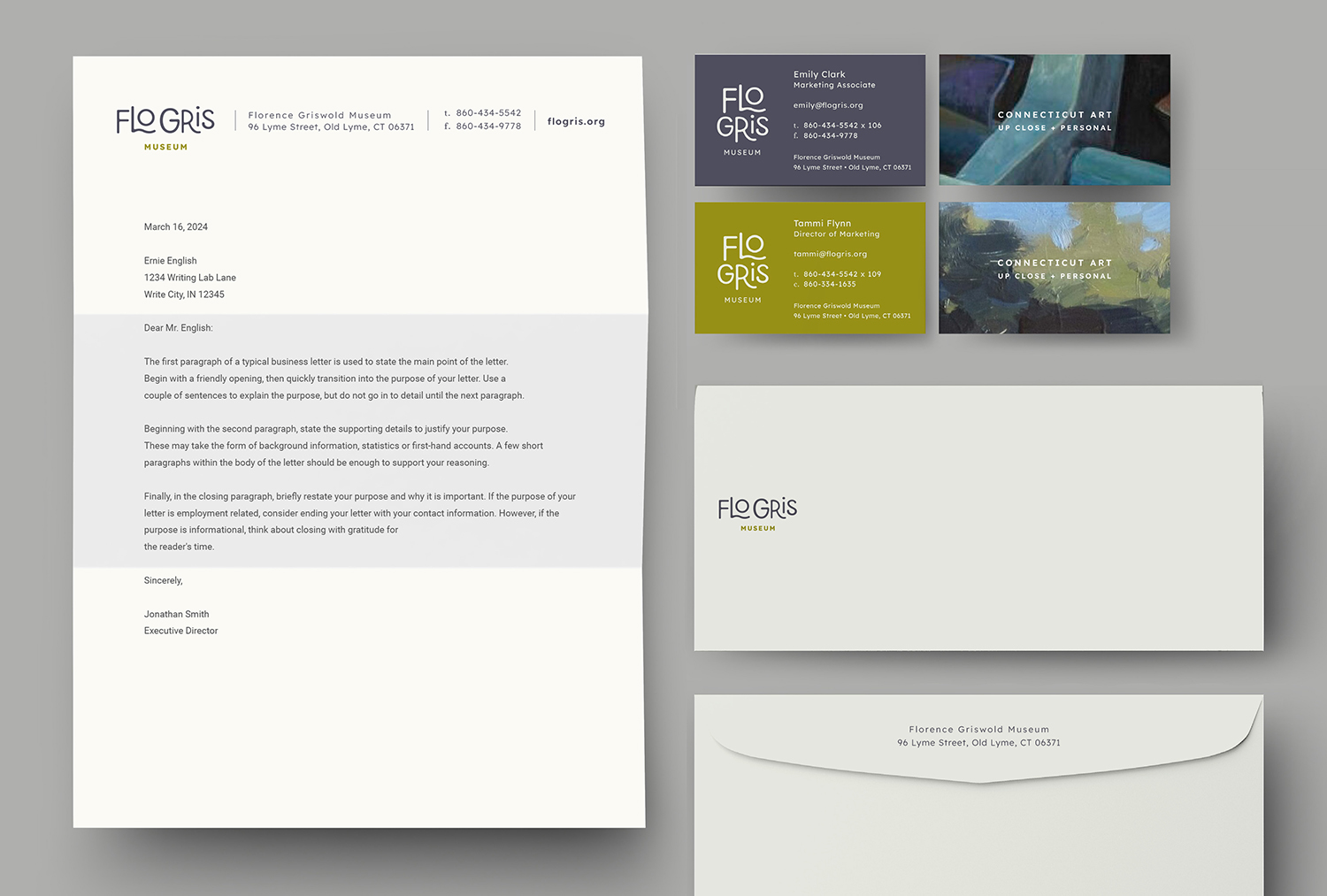
The logo placement depends on the type of communication and use.

Application icons
Social media icons
Logo Color
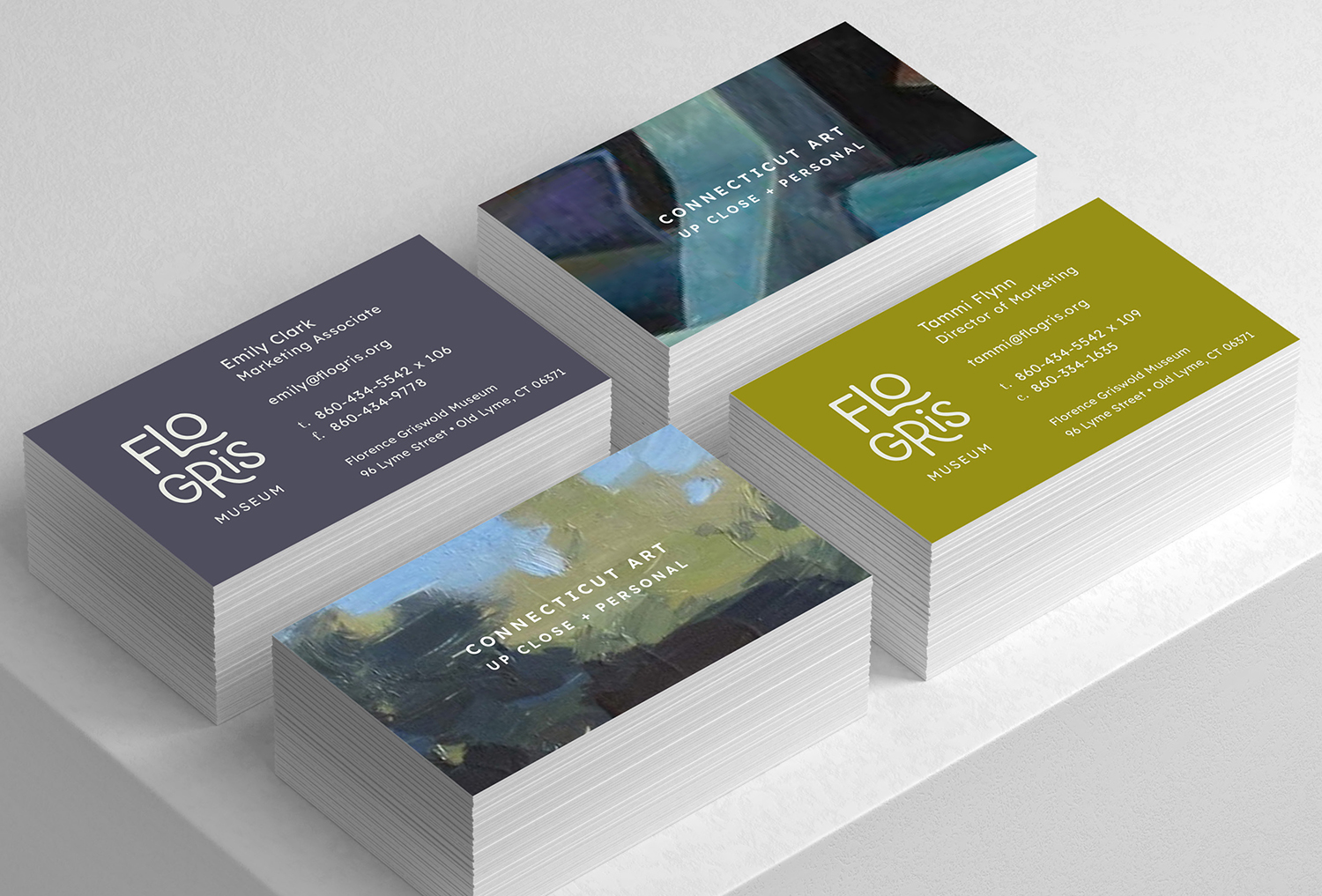
Full color logos should be placed on light color backgrounds. Knocked out logos (white) should be placed on brand color backgrounds.
Logo Scale Horizontal
Smallest size: for web: 108 pixels wide / Smallest size: for print: 1.5 inch wide.

Logo Scale Vertical
Smallest size: for web: 75 pixels wide / Smallest size: for print: 1 inch wide.

Logo Guidance
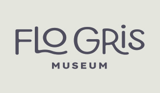
Don’t stretch the logo.
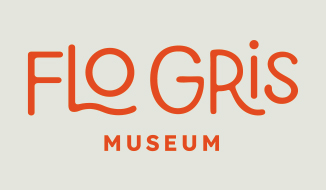
Don’t use the logo in a non-brand color.
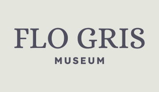
Don’t use other fonts.
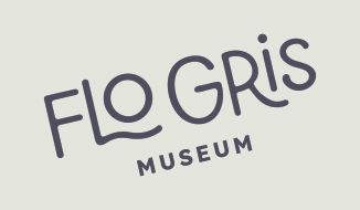
Don’t use the logo at an angle.
04 | Brand Colors
The brand colors provide accessibility, simplicity, and consistency throughout all brand communications.

RGB 180 170 53
CMYK 17 12 89 20
HEX b3a935
PMS 606U
PMS 612C

RGB 79 78 94
CMYK 67 62 42 32
HEX 4e4d5d
PMS 5255U
PMS 5275C

RGB 227 229 221
CMYK 5 2 8 5
HEX e3e4dc
PMS Warm Gray 1U
PMS Warm Gray 1C

RGB 150 138 25
CMYK 19 18 100 34
HEX 968918
PMS 612U
PMS 613C

RGB 121 115 91
CMYK 34 31 53 37
HEX 78735a
PMS 450U
PMS 7497C
05 | Typography
Lexend
This headline is three lines and set to Lexend Light 200.
This subhead is half the point size of the headline and set to Lexend Book 300.
The Body Copy is set to Lexend Book 300—Lexend fonts are intended to reduce visual stress and so improve reading performance. Initially they were designed with dyslexia and struggling readers in mind, but Bonnie Shaver-Troup, creator of the Lexend project, soon found out that these fonts are also great for everyone else.
Roboto Condensed
Roboto Condensed can be used for Artwork titles as captions. Roboto has a dual nature. It has a mechanical skeleton and the forms are largely geometric. At the same time, the font features friendly and open curves. While some grotesks distort their letterforms to force a rigid rhythm, Roboto doesn’t compromise, allowing letters to be settled into their natural width. This makes for a more natural reading rhythm more commonly found in humanist and serif types.
Alice

