01 | Mission
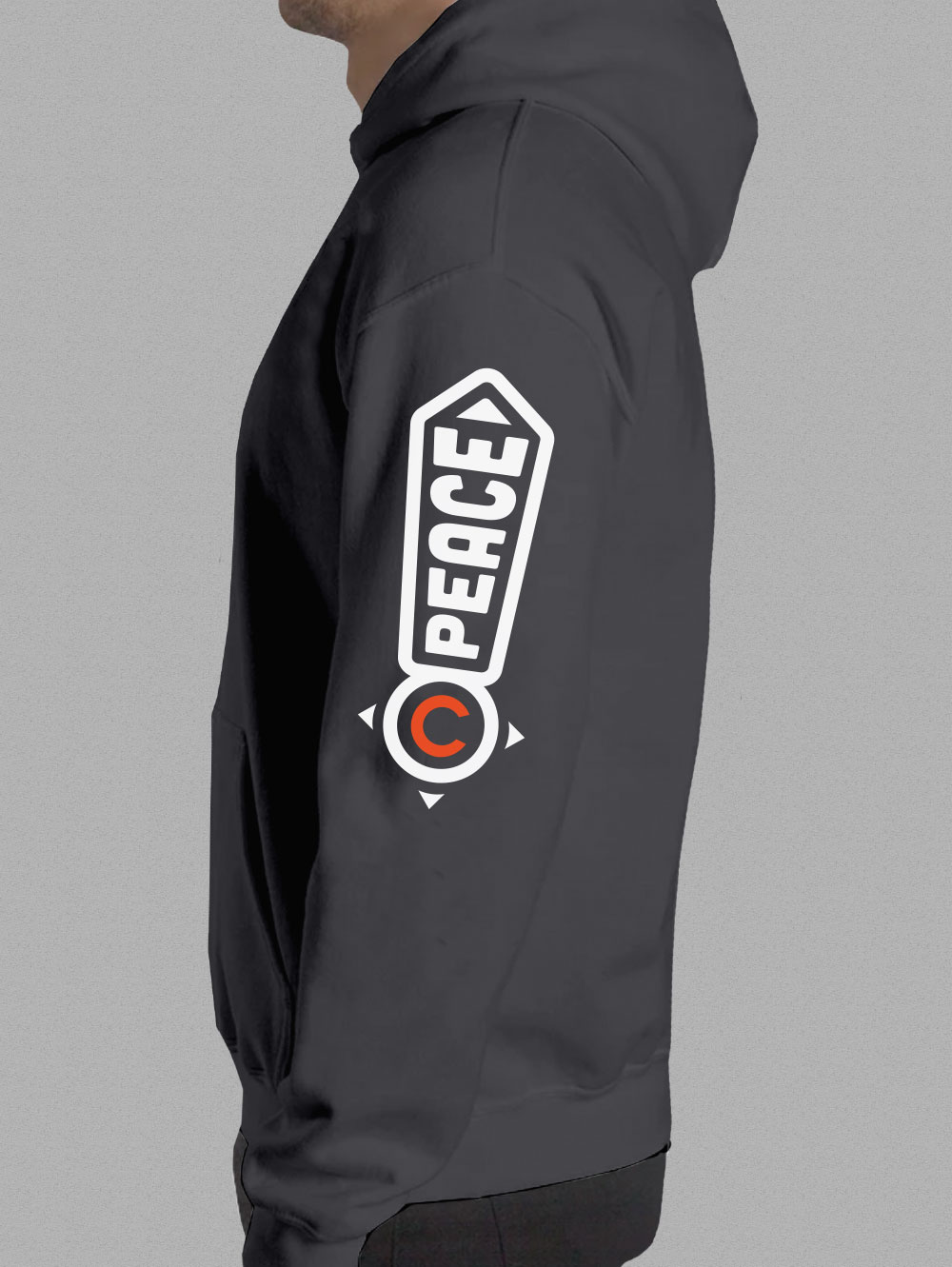
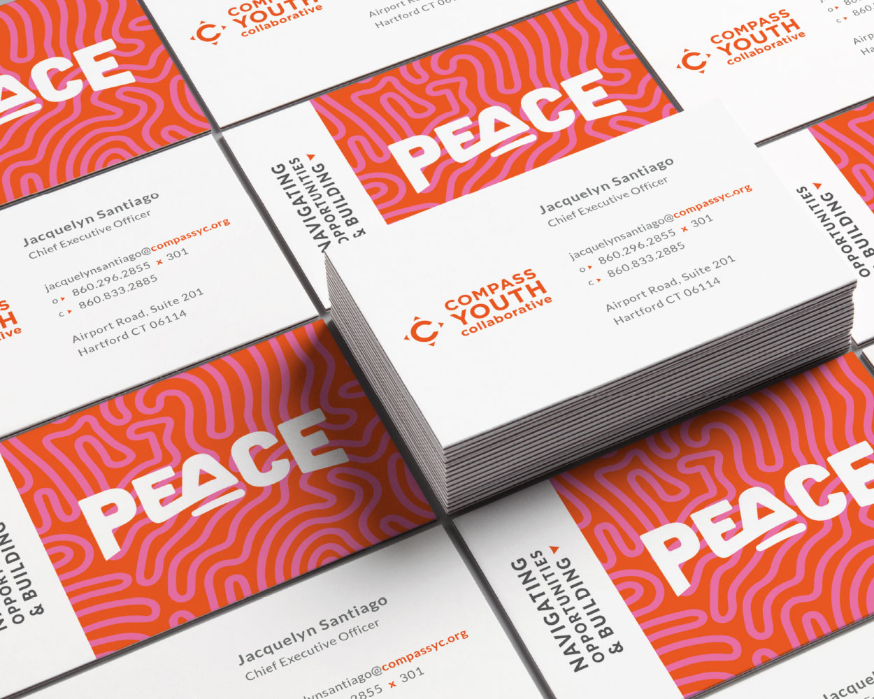
Navigating opportunities and building peace.
02 | Logo
Icon Construction
Made to resemble a compass to guide us on our mission as opportunity navigators.
Logo Clearspace
Clearspace around the logo is equal to the cap height of the letter C.

Logo Clearspace Exceptions
The logo placement depends on the type of communication and use.
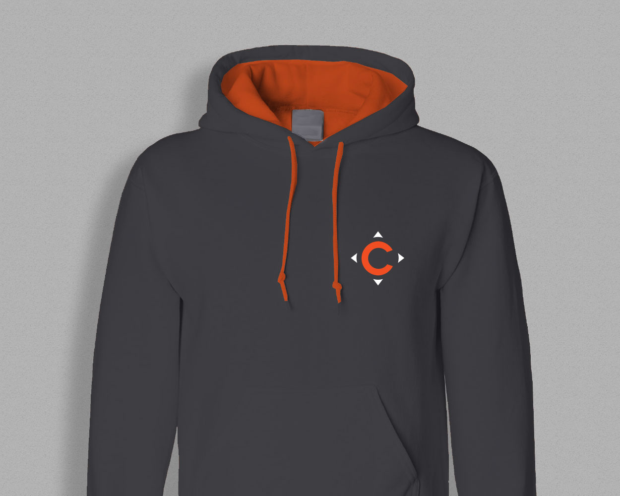
Application icons
Social media icons
Logo Color
Logo should be white on darker backgrounds and gray on lighter backgrounds.
Logo Scale
Smallest size: for web: 108 pixels wide / Smallest size: for print: 1.5 inch wide.

Logo Guidance

Don’t stretch the logo.

Don’t use the logo in a non-brand color.

Don’t use other fonts.

Don’t pair the logo with marks other than the Compass icon.
05 | Brand Colors

RGB 241 89 34
CMYK 0 80 100 0
HEX f15922
PMS 165 C
PMS 165 U

RGB 88 88 91
CMYK 64 56 52 28
HEX 58585b
PMS Cool Gray 11C
PMS Cool Gray 11U

RGB 100 139 166
CMYK 65 37 24 1
HEX 648ba6
PMS 646C
PMS 7461U

RGB 246 140 30
CMYK 0 54 99 0
HEX f68c1e
PMS 157C
PMS 157U

RGB 213 213 213
CMYK 15 12 12 0
HEX d5d5d5
PMS Cool Gray 4C
PMS Cool Gray 4U

RGB 240 116 172
CMYK 1 69 1 0
HEX f074ac
PMS 218C
PMS 218U
06 | Typography
Our primary font is Lato. Lato is a humanist sans-serif typeface designed by Łukasz Dziedzic. It was released in 2015. The name “Lato” is Polish for “summer”.
Primary Font: Lato
This headline is three lines and set to Lato Bold 700.
This subhead is half the point size of the headline and set to Lato Normal 400.
The Body Copy is set to Lato Book 300 — Lato is a humanist sans-serif typeface designed by Łukasz Dziedzic. It was released in 2015. The name “Lato” is Polish for “summer”. Lato is free, open source software. Pa nist acea dipsam ra velest aut evellaboria sed ut excepudanis evendia solorendis maio. Iditatus etur, quis rem esed qui necupieni beatem sitatur molorrore comnitatus esti aspedit.
Secondary Font: Arvo Regular 400

